Understanding Minimalist Icons
- Definition of Minimalist Icons: Minimalist icons are simple, clear, and uncluttered visual symbols used in UI elements to convey meaning or perform functions with minimal detail. Unlike complex icons that may include intricate designs or multiple colors, minimalist icons strip away all unnecessary elements, focusing solely on essential shapes and forms.
- Simplicity in Design: The primary feature of minimalist icon design is its simplicity. These icons use basic shapes and limited lines, making them easy to recognize and interpret quickly. This simplicity contributes to a clean and modern interface, enhancing user experience.
- Visual Clarity and Recognition: Simple icons reduce cognitive load by being immediately identifiable. Their straightforward design minimizes distractions and ensures users can navigate interfaces with ease, improving usability and speed.
- Use of Negative Space: Minimalist icons often use negative space cleverly to create visual interest without complicating the icon. This contrast helps in highlighting the icon’s essential parts, making the design more effective and appealing.
- Contrast with Complex Icons: Complex icons are detailed and may include shadows, gradients, textures, or multiple colors, which sometimes slow down user interpretation. Minimalist icons avoid these embellishments, focusing on flat design principles that prioritize function over decoration.
- Adaptability in UI Elements: Minimalist icons integrate seamlessly across various UI elements and screen sizes. Their uncomplicated design ensures they remain legible on small screens and at different resolutions without losing meaning or quality.
- Consistency in Icon Design: By using a minimalistic style, icon sets maintain visual harmony across a website or app. This consistency helps users quickly learn and remember the icons’ meanings, further speeding up navigation.
- Focus on Essential Functionality: Minimalist icons emphasize clarity of function over ornamental appeal. Each icon’s design corresponds directly to its purpose, ensuring users can intuitively understand its role within the interface.
Characteristics of Minimalist Icons
Minimalist icons are designed to enhance user experience by focusing on essential icon features that promote design simplicity and visual clarity. These icons avoid clutter and unnecessary ornamentation, making navigation intuitive and swift. Below are some typical characteristics that define minimalist icons.
- Simplicity: Minimalist icons embrace a straightforward approach, eliminating superfluous details. This simplicity makes it easier for users to quickly recognize and understand the icon’s function.
- Clean Lines: The use of sharp, clean lines ensures that the icons remain visually distinct and easily identifiable, even at smaller sizes. This contributes to better visual clarity and reduces cognitive load.
- Lack of Unnecessary Detail: Minimalist icons avoid complex patterns, gradients, and textures. By stripping away all non-essential elements, they focus purely on the shape and form that symbolize the intended action or object.
- Consistent Style: Consistency in style across all icons helps maintain a unified look and feel. This coherence supports users in quickly learning and remembering icon meanings, facilitating faster navigation.
- Balanced Proportions: Minimalist icons often use balanced proportions to keep the design harmonious. This balance enhances aesthetic appeal and functional clarity, ensuring the icon is pleasing to the eye and easy to process visually.
- Monochromatic or Limited Color Palette: Many minimalist icons employ a restrained color scheme, focusing on monochrome or a minimal set of colors to highlight essential features without distraction.
Comparison with Complex Icons
- Minimalist icons reduce visual load by stripping unnecessary details, making them quicker to recognize compared to complex icons that often contain ornate elements and intricate designs.
- Complex icons can overwhelm users by presenting too much information at once, whereas minimalist icons focus on essential shapes and symbols, enhancing design effectiveness in navigation.
- Usability improves with minimalist icons because they provide clear, straightforward visual cues that are easy to scan, while complex icons may require longer cognitive processing time due to their detail.
- Icon comparison reveals that minimalist icons tend to maintain clarity across different sizes and screen resolutions, but complex icons can lose effectiveness when scaled down or viewed on smaller devices.
- Design effectiveness is heightened with minimalist icons, as their simplicity supports faster decision-making, reducing hesitation and streamlining user interactions in digital interfaces.
- Overall, minimalist icons support better navigation speed by minimizing distractions and facilitating immediate recognition, outperforming complex icons in practical usability scenarios.
How Minimalist Icons Improve Navigation Speed

- Faster Icon Recognition: Minimalist icons strip away unnecessary details, allowing users to quickly identify the key features and functions they represent. This clear visual communication directly contributes to improved navigation speed as users do not have to spend extra time deciphering complex imagery.
- Reduced Cognitive Load: By simplifying design elements, minimalist icons reduce the mental effort required to process information. This lowers cognitive load, making it easier for users to focus on navigation tasks rather than being distracted or overwhelmed by overly complicated visuals.
- Enhanced User Experience: A cleaner interface with minimalist icons promotes a seamless user experience. Users can navigate intuitively, which elevates overall satisfaction and efficiency when interacting with a digital product or website.
- Consistency in Design: Minimalist icon sets tend to follow consistent shapes, lines, and styles. This uniformity helps users develop familiarity quickly, which speeds up icon recognition and, consequently, navigation speed.
- Improved Visual Hierarchy: The simplicity of minimalist icons allows designers to create clear visual hierarchies, guiding users to the most important elements first. This prioritization enhances navigation by helping users focus on primary actions efficiently.
- Universal Understandability: Minimalist icons often rely on basic, universally recognized symbols which reduce ambiguity. This clarity helps users from varied backgrounds and experience levels navigate interfaces effectively without confusion.
- Optimized for Different Devices: Minimalist icons are adaptable to various screen sizes and resolutions without losing clarity. This ensures fast recognition and navigation speed whether on desktop, tablet, or mobile devices, thereby improving the overall user experience across platforms.
Faster Visual Processing
When it comes to navigating digital interfaces, the brain processes visual information at incredible speeds. Simplified icons play a crucial role in this rapid visual processing, as the brain can quickly identify and interpret basic shapes and patterns without unnecessary complexity. Icon simplicity reduces cognitive load, allowing user attention to be directed efficiently to key elements rather than being distracted by intricate or unclear visuals.
Minimalist icons leverage the brain’s natural ability to recognize familiar, straightforward symbols faster than detailed images. This efficiency in visual recognition means that users spend less time deciphering what an icon represents and more time making navigation decisions. Faster visual processing directly translates to improved user experience, as users can move seamlessly through menus or interfaces without hesitation.
Moreover, icons that are simple and uncluttered guide the eye more effectively, ensuring that user attention is focused where it matters most. This streamlined approach not only speeds up interaction but also reduces frustration and errors caused by unclear iconography. In essence, by embracing icon simplicity, designers enhance the brain’s inherent capacity for quick visual processing, ultimately facilitating quicker navigation choices and smoother user journeys.
Reduced Cognitive Load
Minimalist icons play a crucial role in reducing cognitive load, which refers to the mental effort required to understand and interact with a user interface. By simplifying visual elements, minimalist icons help users process information more quickly and efficiently, leading to smoother navigation experiences.
Here are some ways minimalist icons reduce mental effort and enhance navigation:
- Clarity and Simplicity: Minimalist icons use simple shapes and limited details, making it easier for users to recognize their meaning instantly without overthinking.
- Consistent Visual Language: Using a consistent style of minimalist icons creates predictability, so users don’t have to relearn functions every time they encounter a new icon.
- Reduced Visual Clutter: Fewer and simpler design elements minimize distractions, allowing users to focus solely on the necessary actions and information.
- Quicker Decision Making: With straightforward visuals, users can quickly identify navigation paths, reducing hesitation and speeding up interactions.
- Enhanced Memory Recall: Simplified icons are easier to remember, which lowers the mental load when returning to an interface after a break.
- Improved Accessibility: Clear and concise icons support users with varying cognitive abilities, ensuring that the interface remains intuitive for everyone.
Overall, minimalist icons reduce cognitive load by eliminating unnecessary complexity. This lowered mental effort results in a user interface that feels more natural and responsive, ultimately enabling a smooth and efficient navigation experience for users.
Practical Applications of Minimalist Icons in Navigation Design

In navigation design, minimalist icons serve as powerful tools to streamline user experience and enhance interface clarity. By applying thoughtful UI design tips centered around minimalist icons usage, designers can create navigation that is not only aesthetically pleasing but also highly functional. Below are practical examples and best practices to effectively incorporate minimalist icons in digital interfaces.
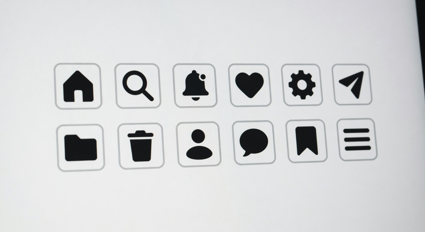
- Use universally recognizable symbols: Choose icons that users can instantly understand without needing additional explanation. For example, a simple magnifying glass for search or a house icon for the homepage ensures users quickly grasp their function, reducing cognitive load and improving navigation speed.
- Maintain consistency throughout the interface: Consistent use of icon style, size, and color reinforces a cohesive visual language. For instance, using a uniform line thickness and monochromatic palette for all navigation icons supports a minimalist aesthetic and avoids confusion.
- Pair icons with clear labels selectively: While minimalist design emphasizes simplicity, pairing icons with short text labels can enhance usability, especially for new or less common icons. This combination serves as an effective UI design tip to improve accessibility and clarity.
- Leverage negative space: Minimalist icons benefit greatly from ample spacing around them. This prevents clutter and makes each navigation element stand out, leading to easier tapping or clicking in touch and desktop environments alike.
- Optimize for various screen sizes: Responsive navigation design using minimalist icons ensures that the icons remain legible and functional on different devices—from smartphones to large monitors. Designers should test icon clarity at multiple resolutions to maintain navigation effectiveness.
- Apply subtle animations for feedback: Adding minimalist hover or tap animations can provide immediate feedback, signaling to users that their interaction was successful. These small touches enhance user confidence and contribute to a smooth navigation flow without overwhelming the minimalist design.
- Organize icons by priority: Place the most frequently used navigation icons in easily accessible locations, such as the top or bottom of the screen. This prioritization supports faster navigation by reducing the effort needed to locate key functions.
- Use icons to reinforce brand identity: Custom-designed minimalist icons can subtly echo a product’s branding while remaining simple and functional, helping users associate navigation with the overall brand experience.
Implementing these best practices in minimalist icons usage within navigation design not only accelerates navigation speed but also contributes to a clean and user-friendly interface. By focusing on clarity, consistency, and user context, designers can craft intuitive digital experiences that meet modern UI design standards.
Mobile App Interface Design
- Optimized Touch Targets: Minimalist icons reduce visual clutter, allowing designers to implement larger touch targets. This enhances the ease and accuracy of touch navigation on mobile UI, making app interactions swift and error-free.
- Effective Use of Screen Space: By focusing on essential app icons only, minimalist design frees up valuable screen real estate. This uncluttered approach ensures users can quickly find and interact with key functions without distractions.
- Clear Visual Hierarchy: Simplified iconography aids in establishing a clear visual hierarchy, directing users’ attention to important navigation elements and improving overall usability in the mobile UI.
- Faster Recognition: Minimalist app icons, stripped down to their core elements, are easier to recognize and remember. This speeds up user navigation by reducing cognitive load during app exploration.
- Seamless Multi-Tasking: A clean interface with minimalist icons supports easier switching between app sections, facilitating fluid touch navigation and enhancing user experience on mobile devices.
Website and Dashboard Navigation
- Enhanced Clarity: Minimalist icons reduce visual clutter, making it easier for users to quickly identify web navigation options and dashboard icons without distraction.
- Faster User Flow: Simple, universally recognizable symbols facilitate quicker decision-making, which speeds up user flow and reduces hesitation when navigating complex interfaces.
- Consistent Design Language: Using minimalist icons creates a cohesive look across websites and dashboards, helping users intuitively understand functionality across different sections.
- Reduced Cognitive Load: Minimalist icons avoid unnecessary details that can overwhelm users, allowing them to concentrate on the task and navigate smoothly through the interface.
- Improved Responsiveness: Simplified icons render well on all screen sizes, preserving navigation speed and clarity on desktops, tablets, and mobile devices alike.
- Quick Recognition: Familiar and straightforward dashboard icons enable users to instantly recognize actions and features, enhancing overall navigation speed.
- Streamlined User Experience: Minimalist icons support a seamless user flow by guiding users efficiently to key information and functions without additional explanation or tooltips.