Understanding Landscape and Portrait Modes
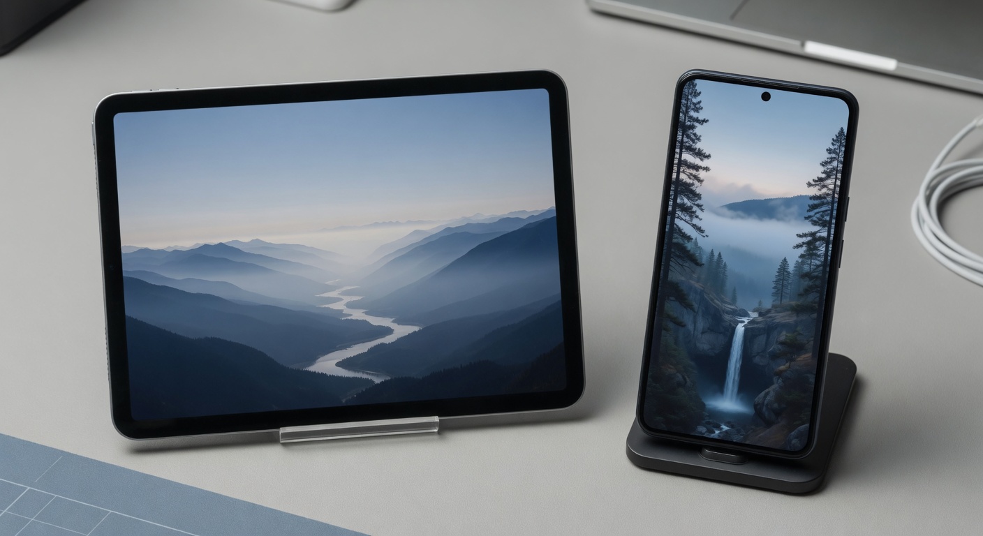
Landscape mode and portrait mode refer to the two primary screen orientations used by digital devices such as smartphones, tablets, and computer monitors. In portrait mode, the screen is oriented vertically, meaning the height is greater than the width, similar to how a traditional printed page is positioned. Conversely, landscape mode orients the screen horizontally, with the width exceeding the height. These orientations are fundamental in shaping how content is displayed and interacted with on various devices.
Modern devices detect orientation changes using built-in sensors, such as accelerometers and gyroscopes, which sense the position and movement of the device. When a device is rotated from portrait to landscape mode or vice versa, the sensors relay this information to the operating system, allowing the interface to adjust accordingly. This automatic detection ensures a seamless transition between the two modes, enhancing the user’s ability to view content comfortably depending on their context and preference.
Understanding landscape mode and portrait mode is crucial for appreciating their impact on user experience (UX). Each mode serves different purposes and can significantly influence how users interact with an application or website. For example, portrait mode is often favored for reading, scrolling through feeds, or video calling, where a vertical layout provides a natural flow. On the other hand, landscape mode is preferred for watching videos, playing games, or working with wider content such as spreadsheets, where a broader view offers better usability.
Screen orientations like landscape and portrait mode form the UX basics that designers and developers consider to ensure applications and websites are flexible, accessible, and user-friendly. An effective UX design takes into account how these orientations affect content layout, navigation, and usability, thereby enhancing overall engagement and satisfaction. Recognizing how devices detect and respond to orientation changes helps create adaptive interfaces that cater to diverse user needs and contexts.
Technical Overview of Screen Orientations
Screen orientation is primarily detected through device sensors such as accelerometers and gyroscopes. These sensors measure the device’s physical position and movements, allowing the system to determine whether the screen is in portrait or landscape mode. The accelerometer senses the direction of gravity, helping the device understand if it is being held vertically or horizontally.
When a change in screen orientation is detected, the device’s operating system triggers rotation detection mechanisms. These mechanisms notify applications that the orientation has switched, allowing them to adjust their display and layout accordingly. This immediate detection is crucial for maintaining a seamless user experience across various device postures.
Software adapts to different screen orientations by dynamically reconfiguring the user interface. Responsive design principles are often employed, where elements resize, reposition, or change visibility based on the current screen orientation. This flexibility ensures that content remains accessible and visually coherent regardless of how the device is held. Furthermore, many apps utilize orientation APIs to programmatically respond to these changes, optimizing interactions and usability depending on whether the device is in portrait or landscape mode.
In summary, the interplay between device sensors, rotation detection, and responsive software enables modern devices to fluidly adapt to screen orientation shifts, enhancing overall user experience.
Common Use Cases for Each Mode
Landscape and portrait modes serve different user contexts and have distinct use cases that leverage their respective advantages. Landscape mode is often preferred for activities requiring a wider field of view. This includes watching videos, playing games, or working with spreadsheets and design tools where horizontal space enhances usability. The landscape advantages shine in these scenarios by providing an immersive experience and better side-by-side content comparison.
Conversely, portrait mode is ideal for reading, browsing social media, or using apps designed primarily for vertical scrolling. The portrait advantages come into play in mobile use cases where one-handed operation and ease of navigation are crucial. This mode fits the natural tilt and grip of handheld devices, making it more comfortable for users engaging in lengthy reading or messaging sessions.
Understanding the user context is key when choosing between modes. For instance, users commuting via public transport may favor portrait mode for quick interactions, while those watching tutorials or presentations on tablets often switch to landscape. Developers and designers should tailor their interfaces to these common use cases, ensuring seamless transitions and optimized layouts that accommodate both landscape and portrait advantages based on the user’s needs.
The Impact of Orientation on User Experience

Orientation plays a crucial role in shaping the user experience (UX) by influencing usability, readability, and overall engagement within an interface. In UI design, the choice between landscape and portrait modes significantly affects how users interact with digital content and navigate through applications or websites.
Usability is impacted by orientation because it dictates the spatial arrangement and accessibility of interactive elements. Landscape mode offers a wider view, which can accommodate more horizontal navigation options, sidebars, or detailed data displays without overwhelming the user. This makes it ideal for tasks requiring panoramic views or multitasking, such as video editing or data analysis. On the other hand, portrait mode supports vertical scrolling and is often more intuitive for reading long-form content, social media feeds, or text-heavy pages. Designers must consider these differences to optimize button placements and interaction zones, ensuring comfortable reach and reducing finger travel in touch interfaces.
Readability also shifts depending on whether content is viewed in landscape or portrait orientation. Portrait mode generally enhances readability by mimicking traditional paper formats, which supports sustained reading sessions and a focused engagement with text. The narrower width limits line length, reducing eye strain and improving scanability. Conversely, landscape mode can be advantageous for content with images, charts, or multimedia elements that benefit from extended width. However, improper scaling or poor adaptation to screen width in landscape can impair text visibility and cause a fragmented reading experience.
Overall engagement in UX design is deeply tied to how effectively orientation meets user expectations and contextual usage scenarios. For instance, mobile users often prefer portrait for ease of single-handed use and portability, while tablet or desktop users may lean towards landscape to leverage broader screen real estate. The key is to design responsive interfaces that seamlessly adapt layout, content density, and navigation structures to the orientation mode actively used. This approach maximizes interaction efficiency and satisfaction by catering to diverse user needs and contexts.
In conclusion, understanding the orientation impact on UX is essential for creating intuitive and appealing UI designs. Both landscape and portrait modes offer unique advantages and challenges in usability, readability, and engagement. Thoughtful consideration of these factors ensures that user interactions are optimized, leading to a superior overall user experience across devices.
Effect on Readability and Visual Layout
Orientation plays a crucial role in determining readability, visual hierarchy, and content layout across different devices. In portrait mode, text readability is often enhanced because the vertical alignment allows for longer lines of text, which is familiar to users reading articles or documents on smartphones and tablets. This orientation supports a natural, scrollable content flow that users expect, thereby improving user flow and engagement.
Conversely, landscape mode provides a broader horizontal space which can benefit visual layout by enabling multi-column content or side-by-side elements. This layout can enhance the visual hierarchy by clearly separating headings, images, and interactive components, making it easier for users to distinguish different sections at a glance. However, longer line lengths typical in landscape may sometimes reduce readability, as the eye has to travel further across the screen, potentially impacting the content layout negatively if not well designed.
Designers must therefore strategically balance these factors, ensuring that the orientation chosen supports the optimal presentation of content without overwhelming the user. A responsive design that adjusts the visual hierarchy and content layout dynamically based on orientation can significantly enhance readability and overall user experience, offering seamless navigation and an intuitive user flow regardless of device or screen size.
User Interaction and Comfort
The orientation of a device plays a crucial role in shaping user interaction patterns and overall comfort. In landscape mode, wider screen real estate allows for more expansive navigation elements, making it easier for users to interact with multiple touch points without feeling cramped. This mode often enhances the touch experience by providing larger buttons and more space between controls, reducing the likelihood of accidental taps.
Conversely, portrait mode is typically more ergonomic for single-handed use, supporting natural thumb movements along a vertical axis. This can improve comfort during extended use, especially when scrolling or swiping through content. However, the narrower width can sometimes constrain the arrangement of interactive elements, potentially requiring more precise touches and adjustments to navigation design to maintain usability.
Both orientations influence how users engage with content and interface controls, emphasizing different strengths. While landscape mode benefits touch experience through spacious layouts, portrait mode offers intuitive comfort suited for quick, on-the-go navigation. Understanding these dynamics is vital for designing interfaces that optimize user interaction, comfort, and efficient navigation regardless of how the device is held.
Best Practices for Designing with Both Orientations
Creating a responsive design that excels in both landscape and portrait modes requires a thoughtful approach to ensure an adaptive UI that enhances user experience (UX). One of the key UX best practices is to prioritize flexibility in your layout. Use fluid grids, flexible images, and scalable typography to seamlessly adjust content according to orientation changes without compromising readability or usability.
Orientation design should start with a mobile-first mindset. Design for the smallest screen in portrait mode and progressively enhance for larger screens and landscape orientations. This approach ensures that essential content remains accessible and that users in either mode have a consistent experience. Implement media queries and viewport settings that detect orientation shifts and trigger appropriate layout adaptations.
Seamless transitions between modes can be achieved by minimizing drastic layout changes that disrupt the user’s flow. Instead, opt for subtle reorganizations that maintain context and hierarchy. For example, in portrait mode, prioritize vertical scrolling with stacked content, while in landscape, leverage horizontal space for side-by-side components or expanded menus. This strategy keeps the interface intuitive regardless of how the device is held.
Another recommendation is to optimize touch targets and interactive elements for both orientations. Elements should be easily tappable without crowding the interface or causing accidental interactions. This is crucial because landscape mode often changes hand positioning and reachability. Consistent spacing and alignment support an adaptive UI that responds naturally to user input patterns across orientations.
Testing your designs on real devices in both orientations is essential to validate your responsive design strategy. Pay attention to performance, load times, and visual consistency. Tools like browser developer modes are helpful, but physical testing unveils nuances in how users hold and interact with devices. By continuously refining your approach based on such feedback, you can deliver an exceptional user experience that confidently bridges landscape and portrait usage.
Responsive and Adaptive Layout Techniques
Effective responsive design and adaptive UI strategies are essential for creating flexible layouts that enhance usability across diverse screen orientations. By dynamically adjusting content based on whether a device is in landscape or portrait mode, designers can ensure an optimal user experience that feels natural and intuitive.
Responsive design employs fluid grids and flexible images to adapt the interface seamlessly. This approach allows the layout to resize and reorganize content automatically, maintaining readability and functionality regardless of screen size or orientation. For instance, elements that appear side-by-side in landscape mode may stack vertically in portrait mode, conserving space without sacrificing clarity.
Adaptive UI goes a step further by dynamically changing the interface components and interactions based on context, including screen orientation. This can involve modifying navigation patterns, resizing touch targets, or altering the hierarchy of displayed information to better suit the user’s current view. These adjustments help reduce cognitive load and improve engagement.
Combining responsive design with adaptive UI techniques results in flexible layouts that not only respond to screen size but also intelligently adjust according to orientation. Such an approach greatly improves usability by delivering content and controls optimized for the user’s immediate environment, making the experience smoother and more enjoyable.
Testing and User Feedback
Usability testing is crucial when designing user interfaces that function effectively in both landscape and portrait modes. Different orientations can significantly alter how users interact with an interface, making it essential to conduct orientation testing to understand these variations. By evaluating the user experience in both modes, designers can identify specific usability issues that might only surface during one orientation.
Integrating user feedback into the design process further enhances the usability of interfaces across orientations. Users provide valuable insights into how they naturally use applications in varying contexts and positions, making their feedback indispensable for refining both landscape and portrait experiences. This iterative process ensures that the interface adapts fluidly to user preferences and functional needs.
A/B testing is a powerful tool in this context, allowing designers to compare different versions of an interface in both orientations. Through A/B testing, subtle but impactful changes can be assessed, ensuring that the final product delivers a seamless user experience regardless of device positioning. This methodical approach helps optimize design decisions based on real user behavior and preferences.
Ultimately, thorough usability testing combined with ongoing user feedback and orientation testing ensures that interfaces are truly user-centric. Such comprehensive testing practices lead to a more intuitive and satisfying experience for users, whether they prefer landscape or portrait mode, thereby boosting overall engagement and satisfaction.